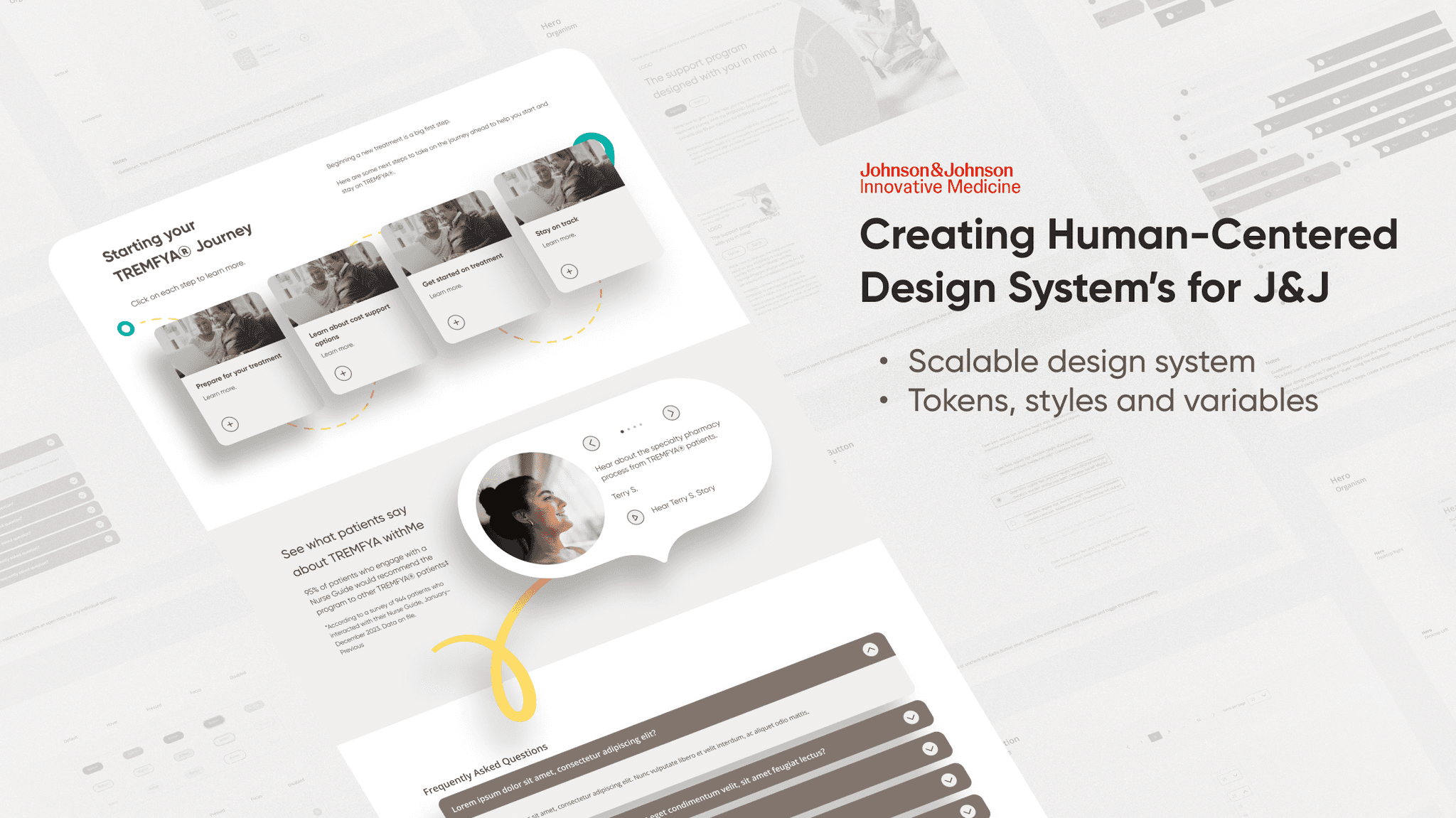
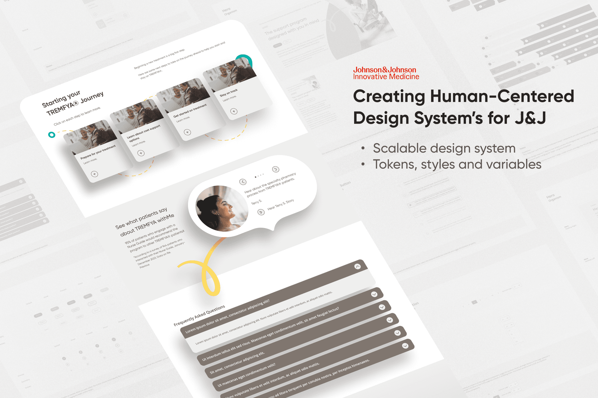
Uniting Brands With Design Systems
Design System, User Research, UI
INTRODUCTION
An opportunity to come together.
As J&J Innovative Medicine has continued to grow and work with more agencies, their existing digital experiences have become inconsistent. Project launches are delayed and stakeholders are frustrated.
This case study explores my design process for the creation of two design systems, with the goal of unifying digital experiences across J&J Innovative Medicine.
My role
UX Designer — Interaction Design, UI Design, User Flows, User Research
Timeline
Delivered in 3 months — January 2024
Team
6 UX designers, 4 senior UX designers, 3 developers, 2 marketing strategists, 3 producers
The Challenge
Unite J&J's siloed teams and create channels for collaboration in under 3 months.
RESEARCH
So, what were the real issues?
Discovering the real problem.
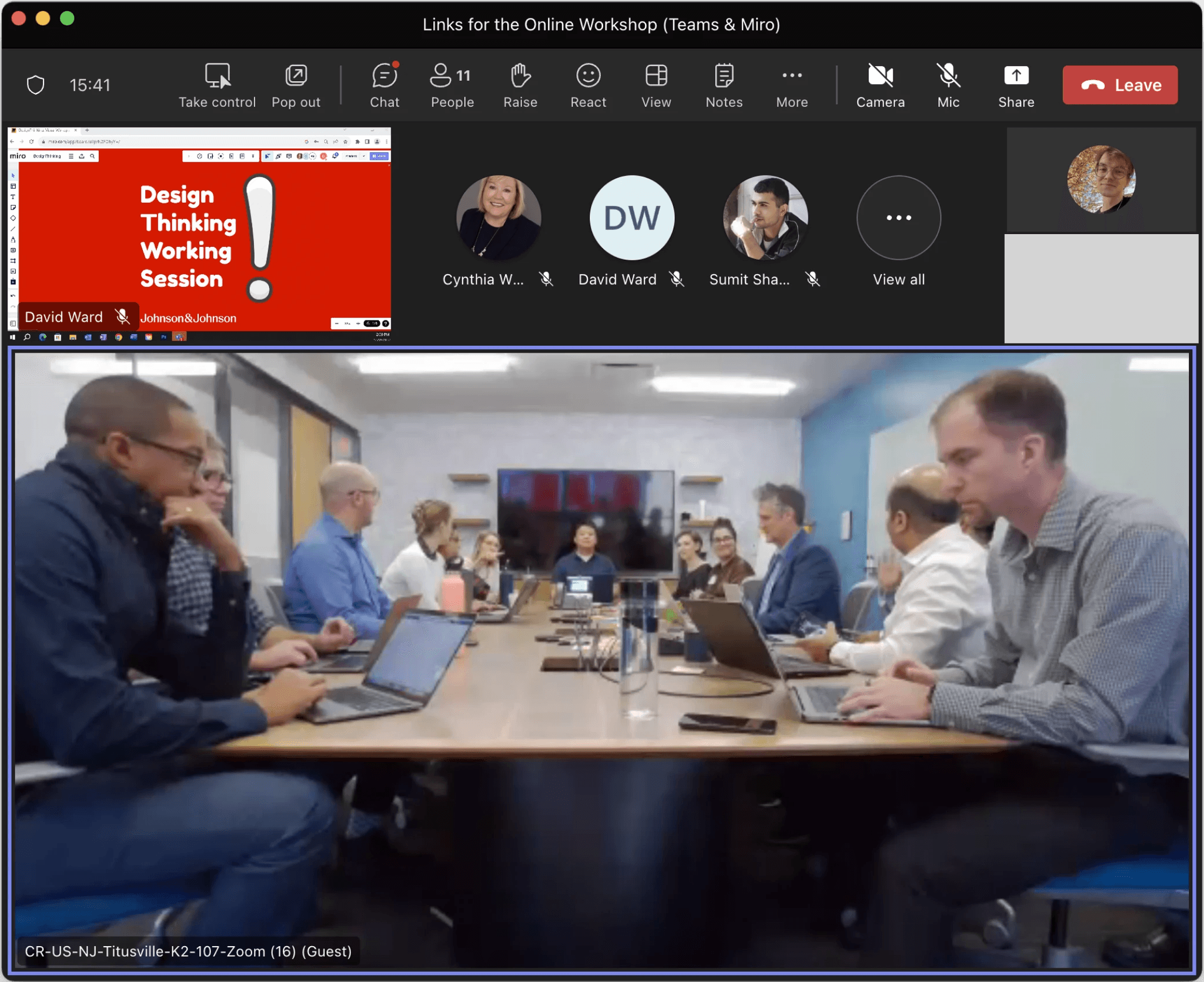
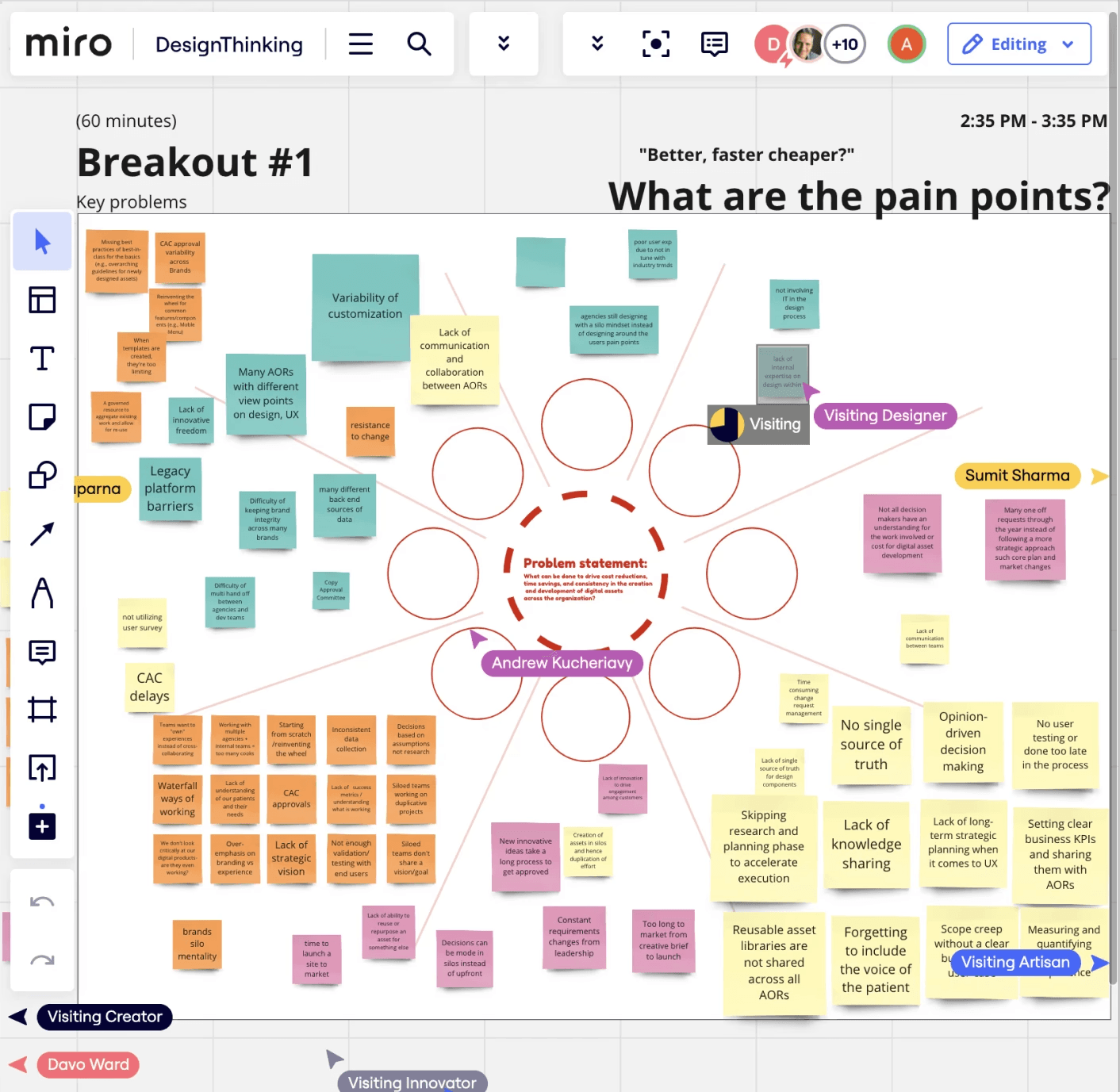
We started by leading a design workshop and conducting 7 user interviews. The goal was to understand each stakeholder and avoid assumptions. The design thinking workshop revealed as many organizational pain points to our stakeholders as it did to us.
Design Thinking Workshop (.IMG)
Communication breakdown.
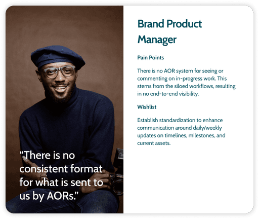
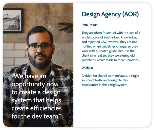
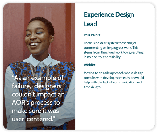
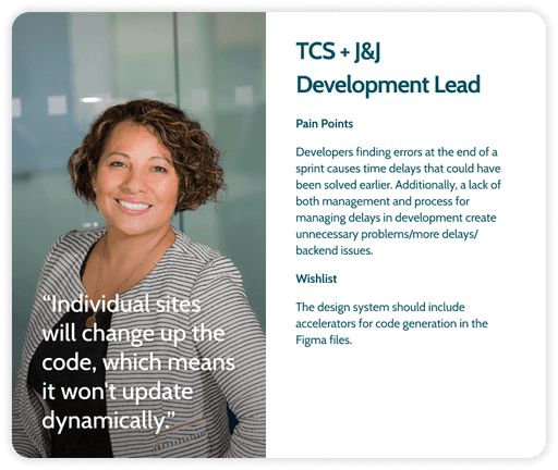
We found that each stakeholder's problems were centered around communication. To more deeply empathize, we crafted 5 personas. They helped transform emotional pain points into design opportunities.
From the personas and stories, we learned how a lack of early communication was causing friction. Without early moments to review designs, delays cascaded into more delays.
Stakeholder Personas (.IMG)
Opportunities to reduce inefficiencies
We aimed to understand where the system was breaking down so we could solve it.
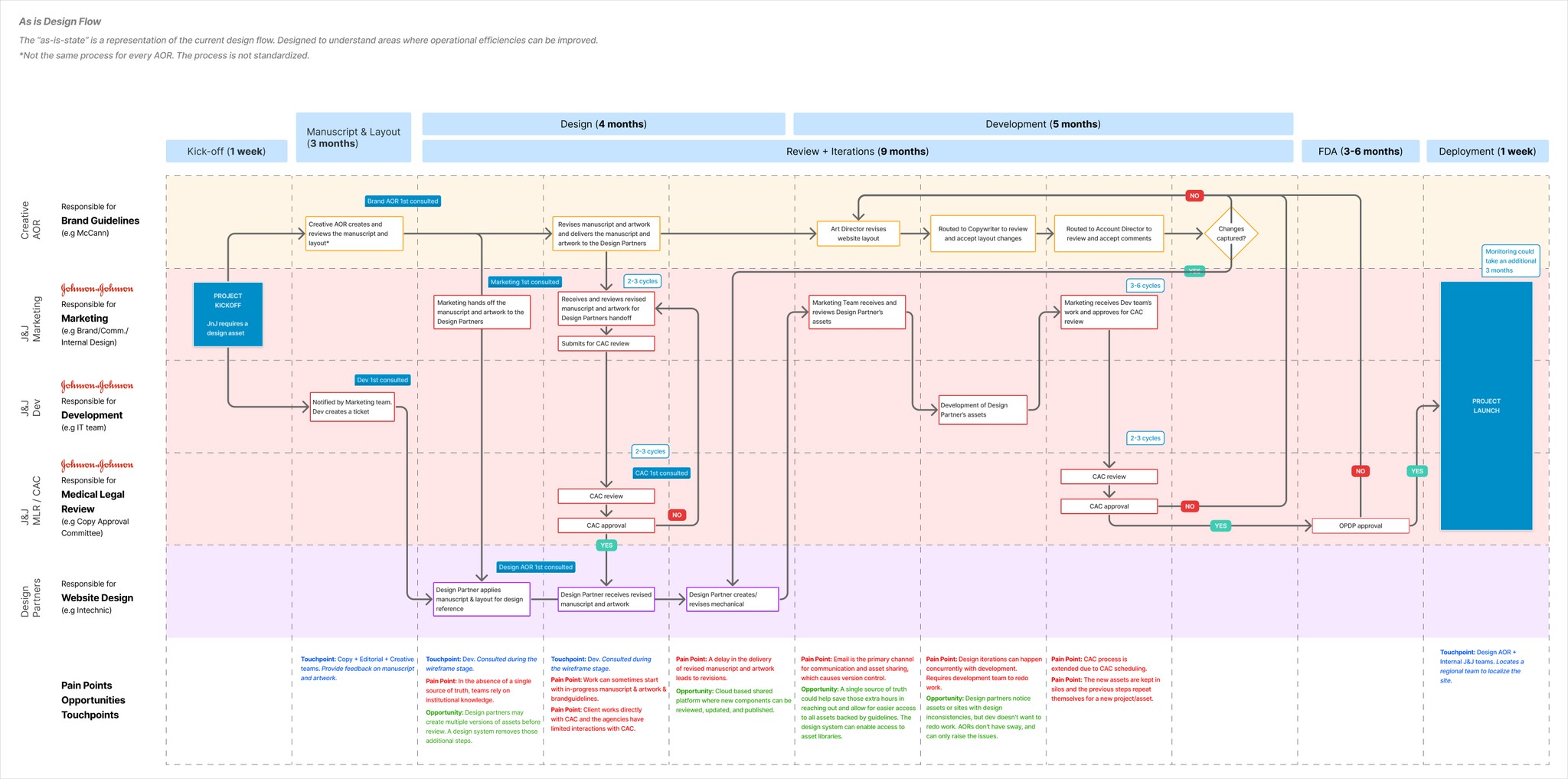
To do so, our team mapped out the asset creation and development process. A journey map of emotional and procedural moments, backed by data and stories. From this, we identified several moments we could save everyone time and create clarity.
For example, design agencies would create multiple versions of designs before submitting. This precaution was because of how few design assets would be approved on first pass. An issue caused by outdated components and guidelines.
Design Process Flow (.IMG)
Reocurring issues.
From our research, we identified three recurring issues across all user experiences. Here is what we learned:
No Accountability. When design agencies felt limited by UI kits, brand identity suffered. This led to inconsistent sites.
Lack of Standardization. Siloed resources created friction between teams and delayed product launches.
Lack of Socialization. Outdated channels resulted in design review delays. This delayed feedback.
Applying our research.
Our insights led us to determine J&J’s processes had to be centralized—a single source of truth. A design system to unify siloed teams and create channels for socialization.
Following this we were able to turn what were once problems into chances to overdeliver:
Publishing Figma Libraries. We set out to create Figma libraries designers would be able to confidently use.
Standardizing Guidelines. We aimed to streamline siloed resources. Standardizing best practices to deliver sooner.
Creating Socialization. Cloud based documentation would enable all teams to collaborate seamlessly and in real time.
DESIGN PROCESS
Where did you start designing?
Creating a solid and scalable foundation.
Design agencies were detaching components to make the smallest change. Individually fixing layouts added hours of work. Creating a design system that agencies would adhere to would save everyone time.
Here are some of our design system's key features. The ways we built it to scale with designer's needs and streamline communication.
Before
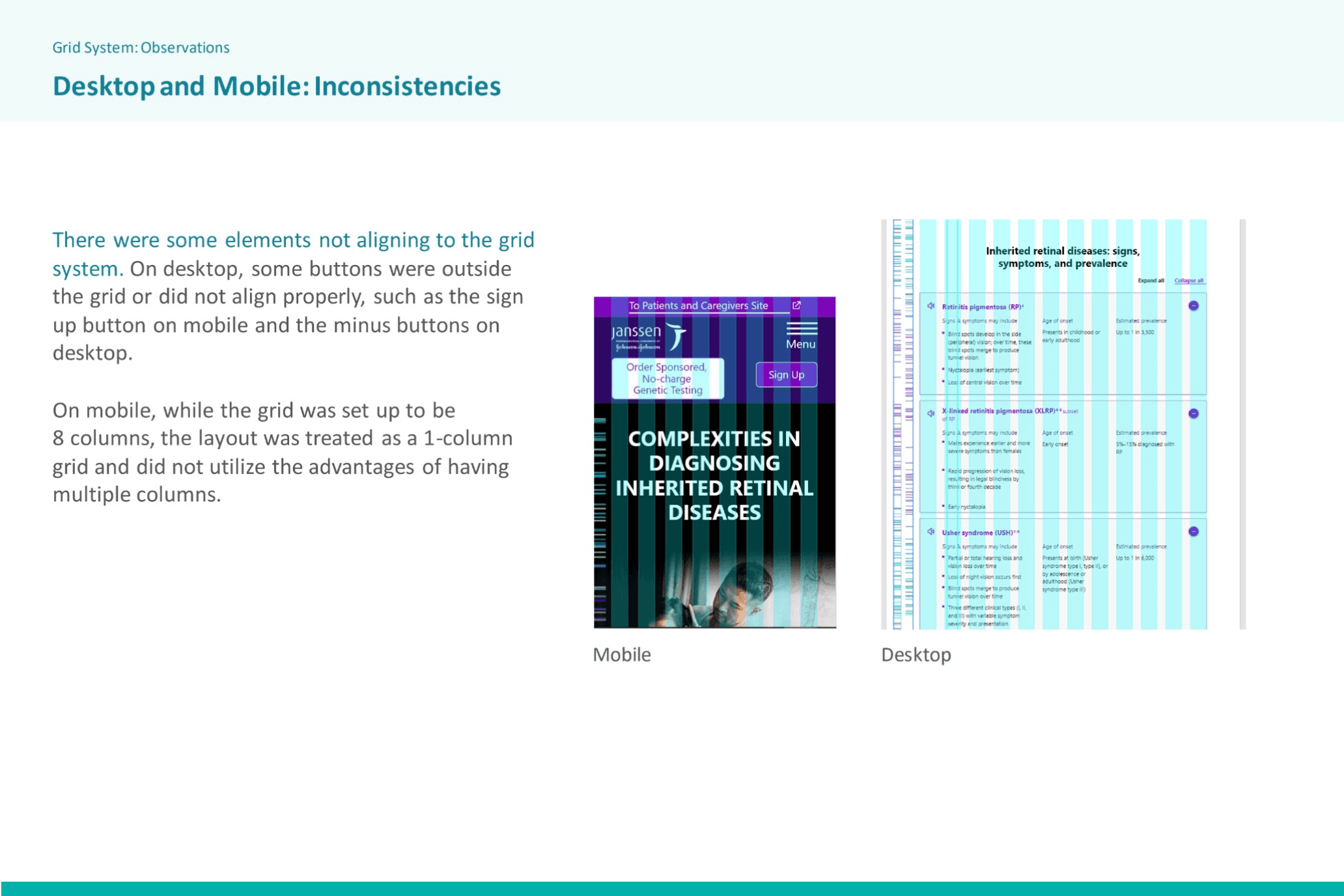
Sites were not aligned to a base grid, creating inconsistent experiences.
After
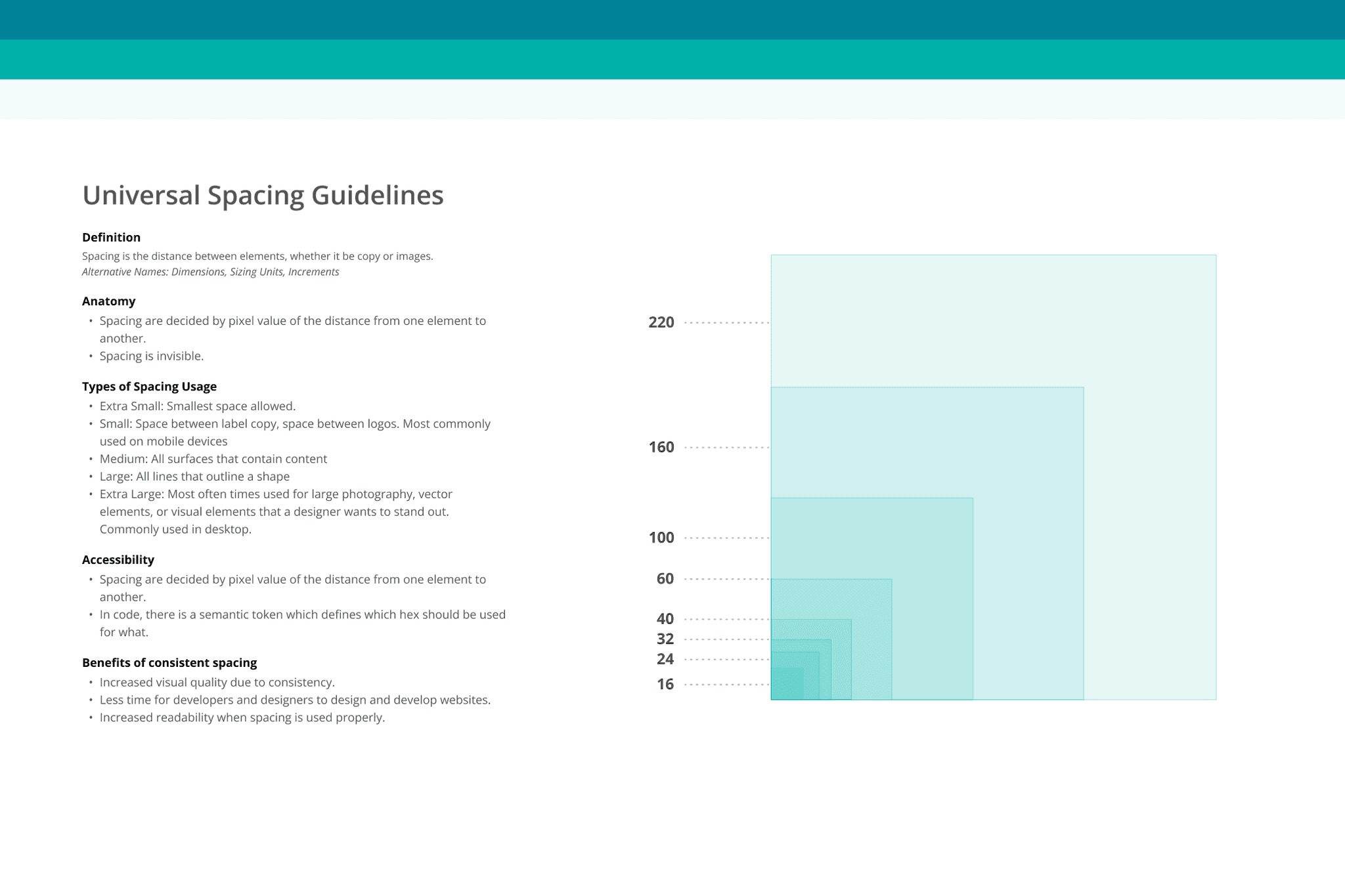
To address this, we audited J&J websites to create spacing and layout rules for our foundational grid system.
Before
Components lacked responsiveness and had inconsistent styling. Because of this, they were often detached.
After
To address this, we embraced tokens, styles and variables which formed a cohesive design system.
Before
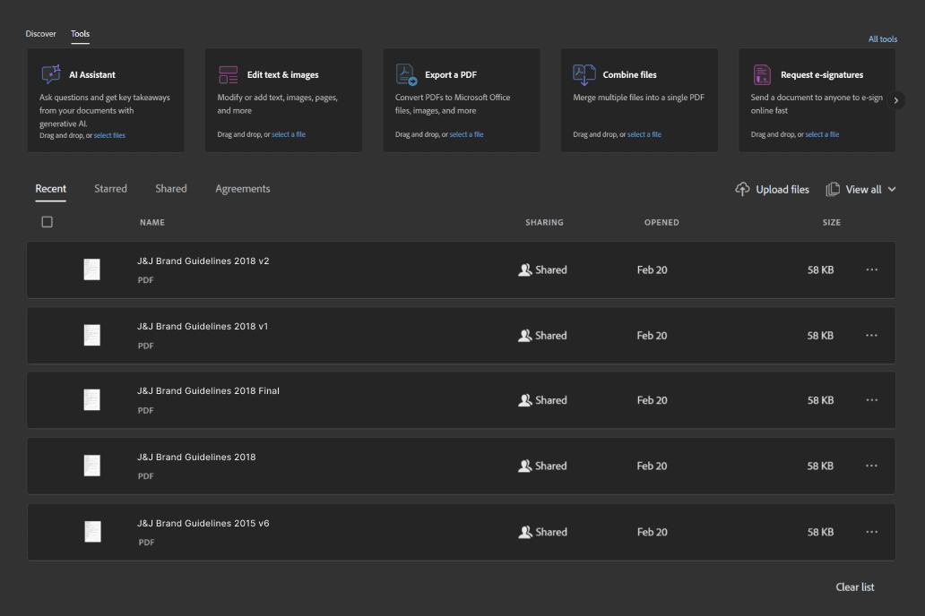
With nowhere to look for guidelines, designers were forced to rely on siloed out of date documentation.
After
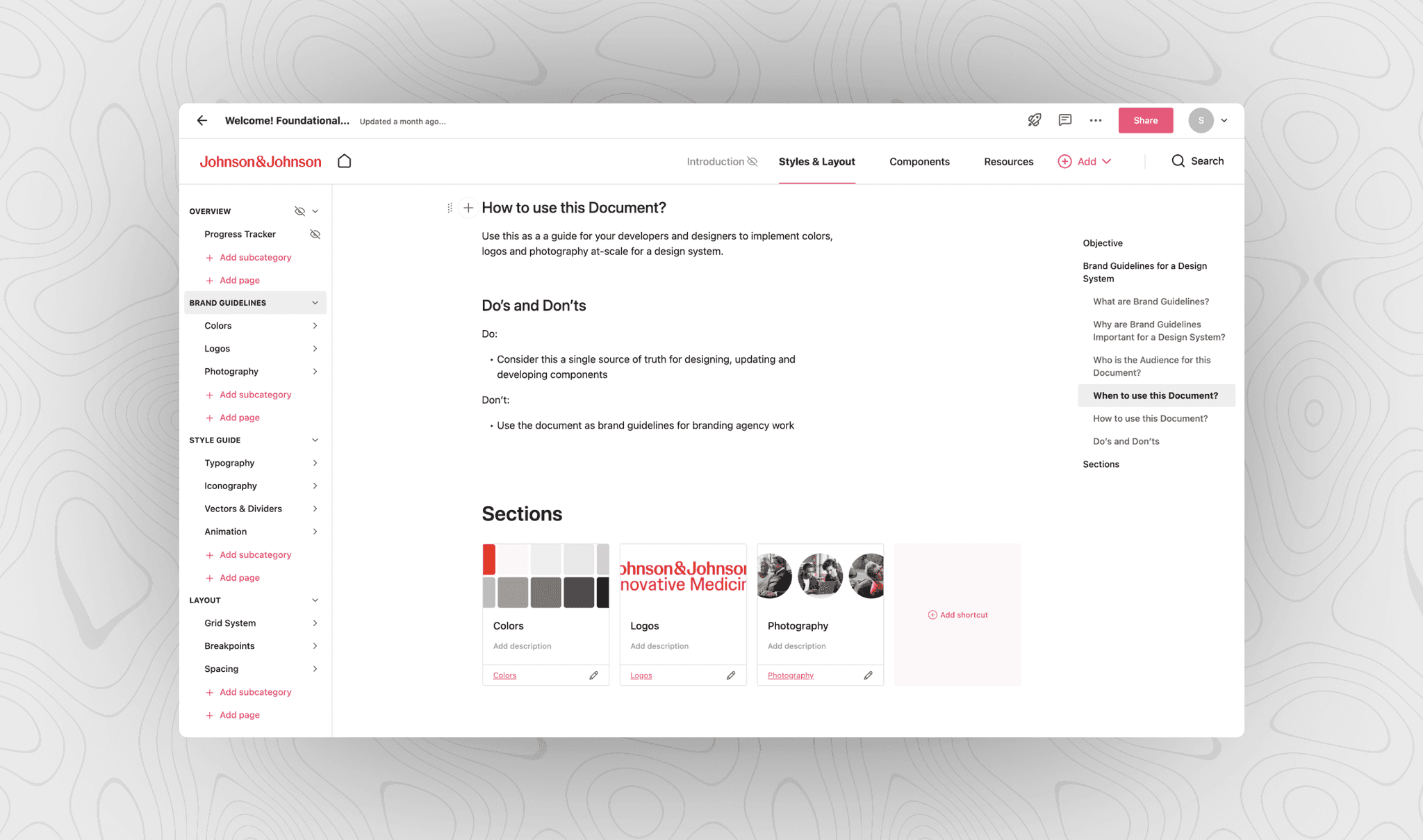
To unify siloed information, we additionally created a cloud based documentation platform — zeroheight.
Before
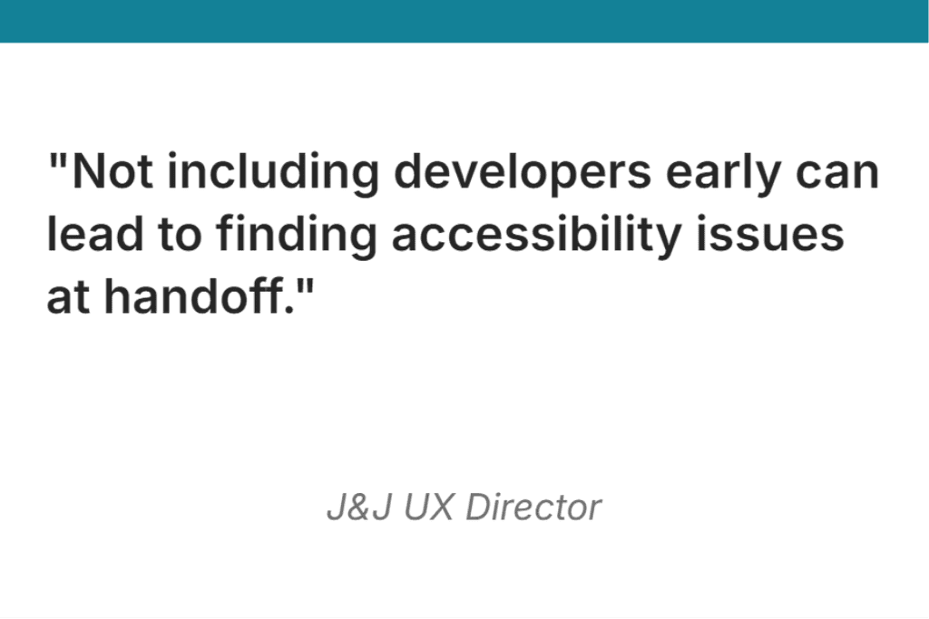
Developers were in the dark. Without tools to review in-progress assets, issues piled up.
After
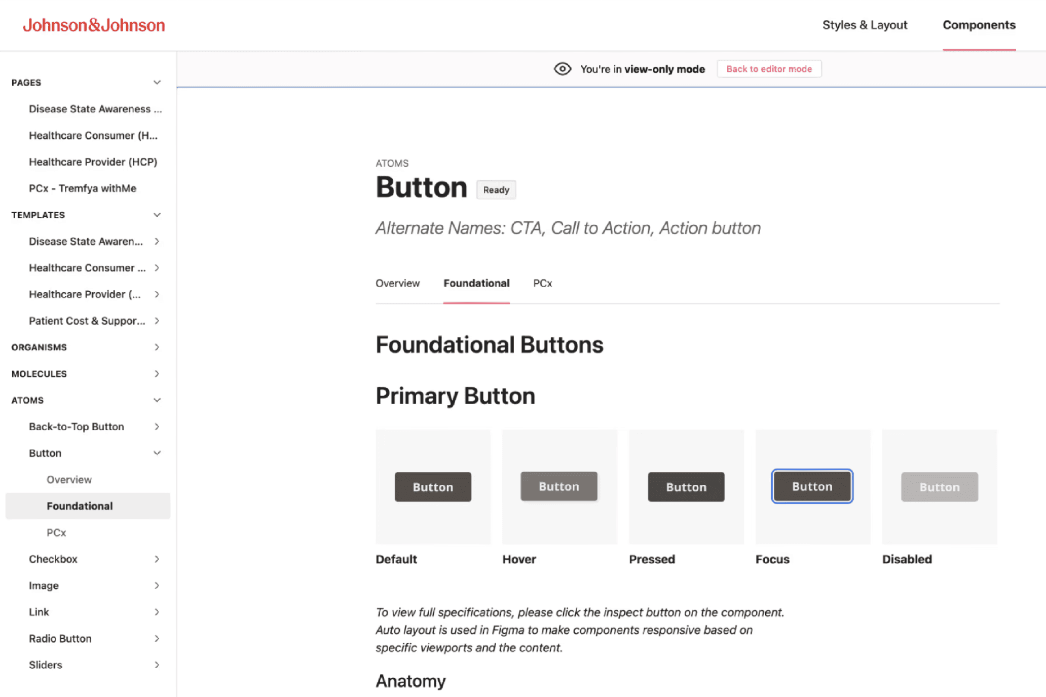
We integrated Storybook into zeroheight. A system to help developers review in-progress design assets.
DESIGN SYSTEM
Grid System Architecture.
A framework for responsive design.
We established a robust Grid System Architecture to serve as the backbone for layout consistency. This system was carefully chosen to maintain flexibility while aligning with the foundational principles of the design language.
A consistent visual experience across every J&J brand
Grid Layout (.IMG)
Establishing visual identity.
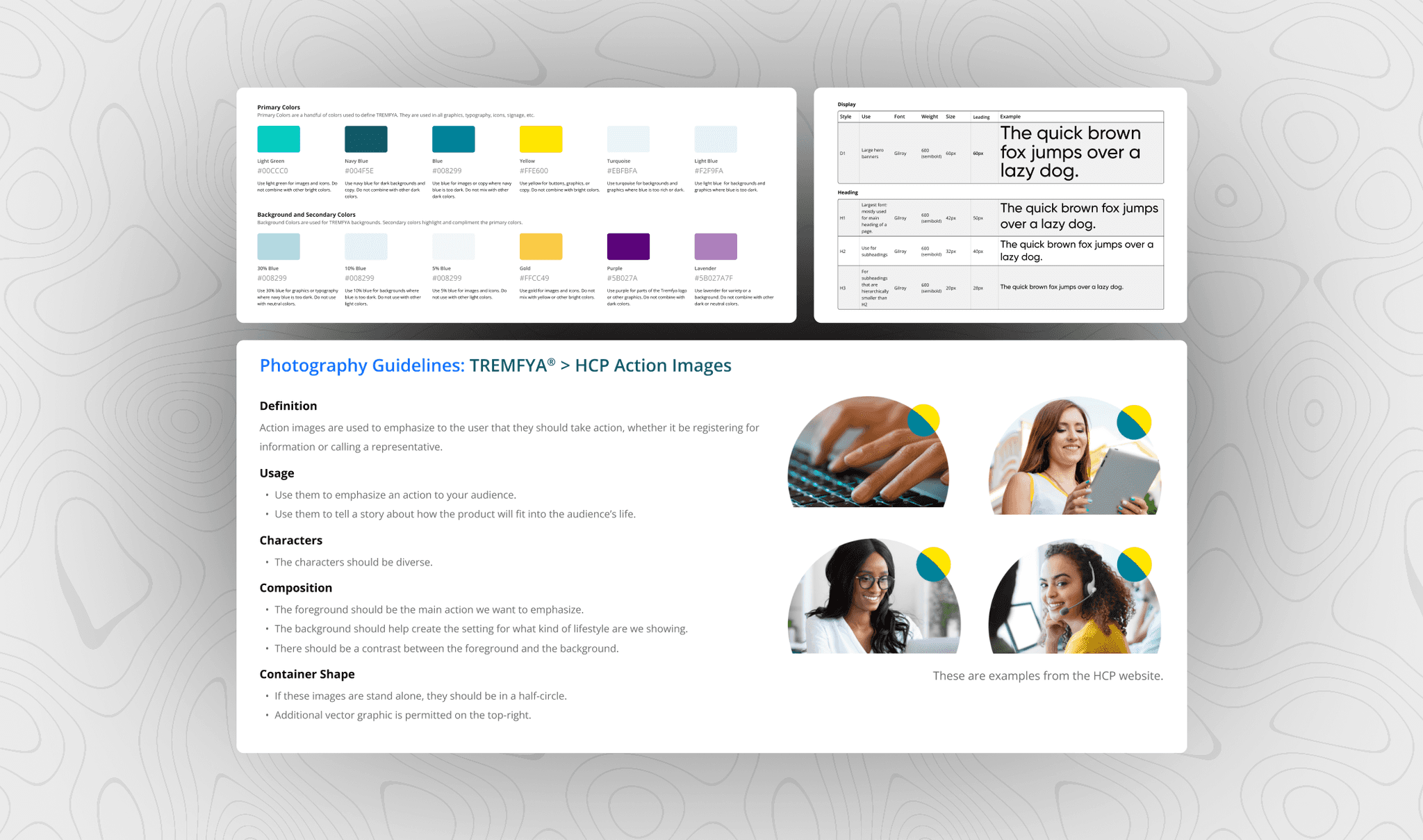
The Brand & Style Guidelines specifies colors, logos, typography, and photography usage. These documents improve user consistency, brand integrity, and provide clear guidance to designers and developers.
Finally, standardizing guidelines across the whole J&J family.
Brand & Style Guidelines (.IMG)
Collaborative platform for design documentation.
To complement the Figma design system, we created a zeroheight site with Storybook and Figma integration. zeroheight became our design system documentation, uniting everyone together on one platform. Storybook provided a communication channel between designers and developers.
Now, stakeholders are reviewing nearly finished assets from day one.
J&J zeroheight Documentation (.IMG)
Finally — unified design systems.
PCx Design System >
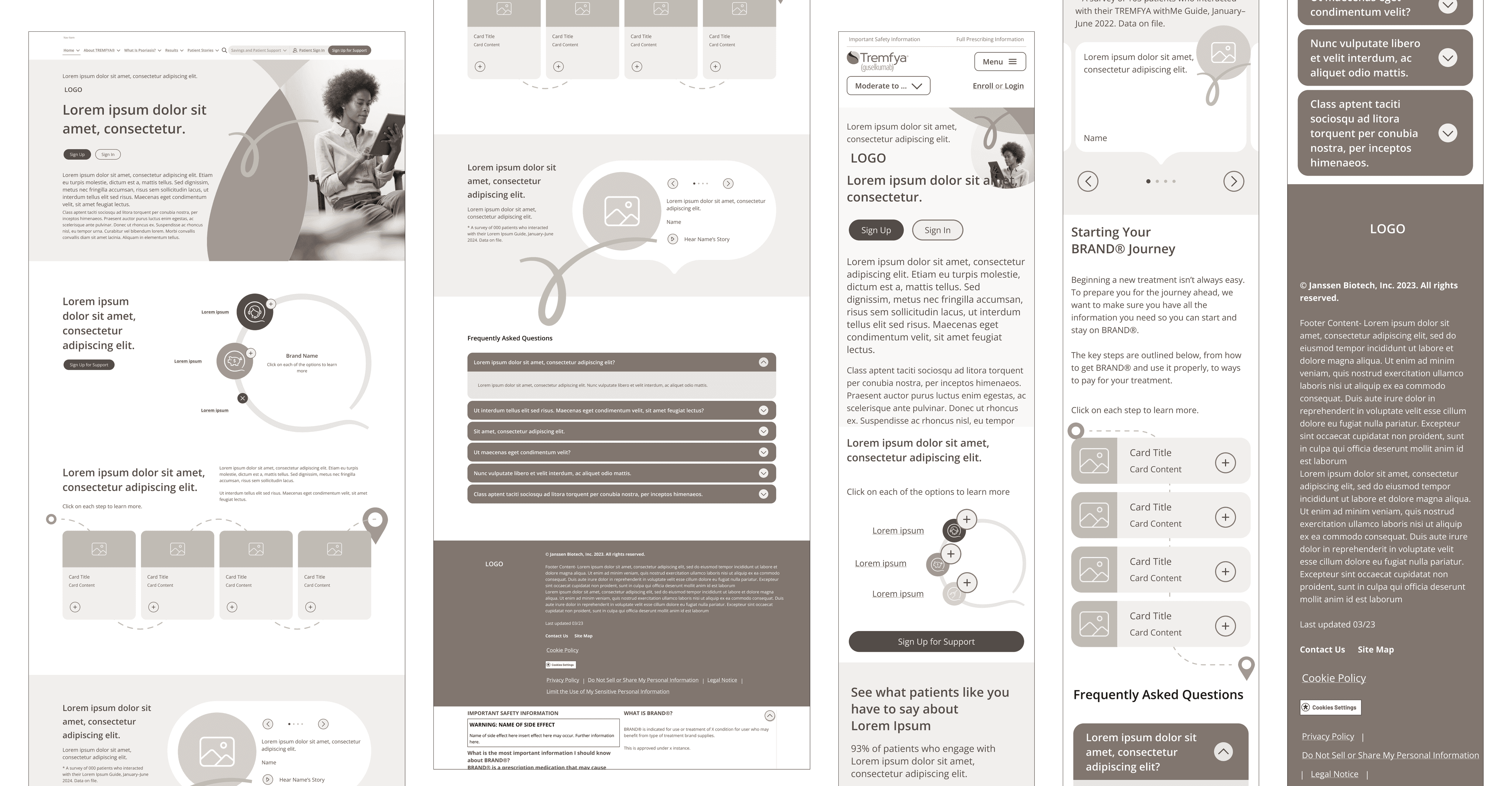
27 individual components for the TREMFYA® PCx brand.
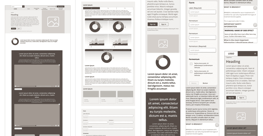
Foundational Design System >
51 components designed from a universal perspective.
REFLECTION
Did your design system make an impact?
Design system = happy designers.
Yes! Rolling out the design system to J&J’s teams and design agencies had an incredible impact. Using zeroheight and Storybook reduced review cycles significantly. This not only saved costs, but gave valuable time back to designers to think about improving the user experience.
We delivered a product which improved communication, streamlined workflow, increased efficiency, and formed partnerships. Now, the designers and the customers were satisfied.
45%
total reduction in asset delivery time
7+ Teams
still using the design library today
$600K
product launch
What I learned.
Each step presented learning opportunities that I am excited to bring to all future projects.
Within three months, we conducted workshops and stakeholder interviews, completed a comprehensive component inventory and audit of multiple sites, and delivered two design systems.
Here are the three primary lessons I learned along the way.
Systems are designed for people. Designers break rules that slow them down. I learned to adapt the system for the user.
The importance of a single library. To prepare for agencies siloing our library, we built in branching and security.
Token Management. While tokens were new to Figma, I learned to keep up with design trends, to always stay on top.

