Travel and Itinerary App
Making It Easier To Plan Travel
Project Scope — 2 product designers, 2 back-end developers, 1 marketing
Timeline — 12 months
Areas of Focus — UX Research + UI + App Development
Tools — Figma, Photoshop, Illustrator, InDesign
INTRODUCTION
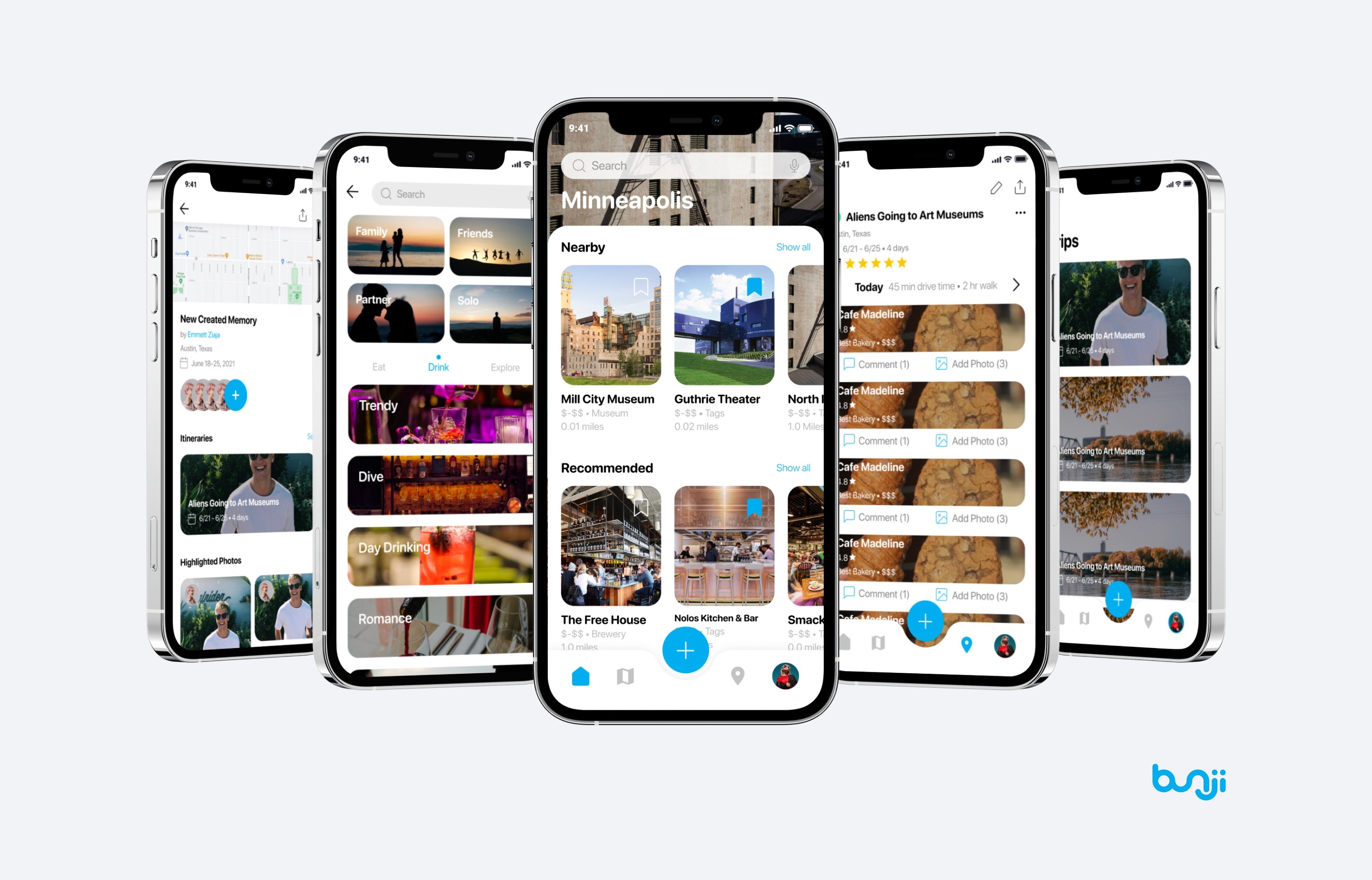
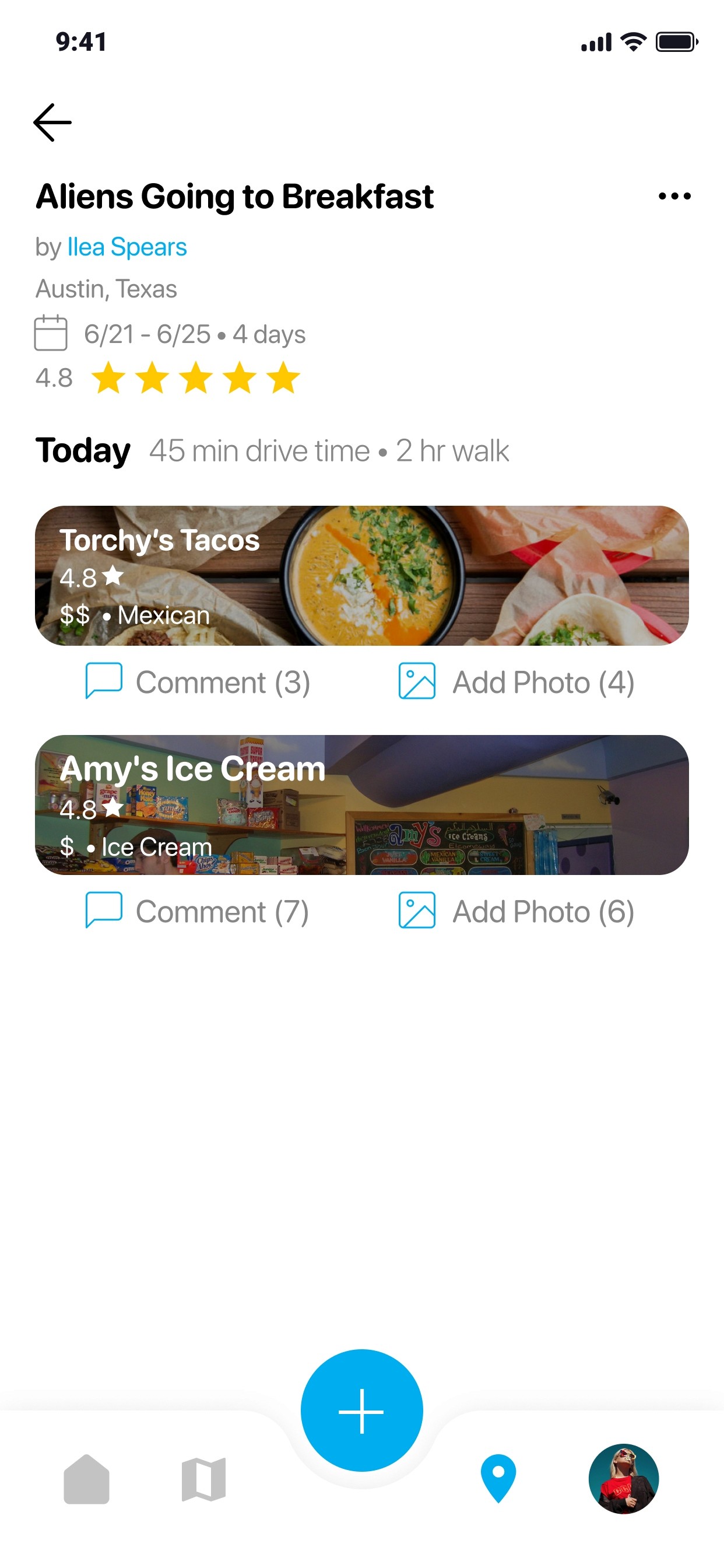
Bunji wants to design a travel app for creating intuitive and fast itineraries to help travelers just go.
Planning a trip has become a stress due to an inundation of information. There is plenty of information, but no resources to help the user.
So, we developed a more user-friendly and personalized travel app using available databases, like GoogleMaps API.
PROBLEM DISCOVERY
The beauty of traveling has been lost to pretty photos with no substance. Travelers need a new way to expand their options.
Bunji became the startup it is because the founders kept hearing folks expressing difficulty in planning fun and unique day plans when traveling. Typically, they were going to websites like Google or Instagram and didn't find a sense of melding with the culture. This sparked a question -
"How might we… create plans people can trust by rewarding quality content?"
OUR SOLUTION
Break down the complex barriers of accessible travel with the help of travelers, allowing anybody to feel like a local.
Create a community based on trust where marketing and followers don't trump over quality content. Root the value of the app in travel before content.
Recommend
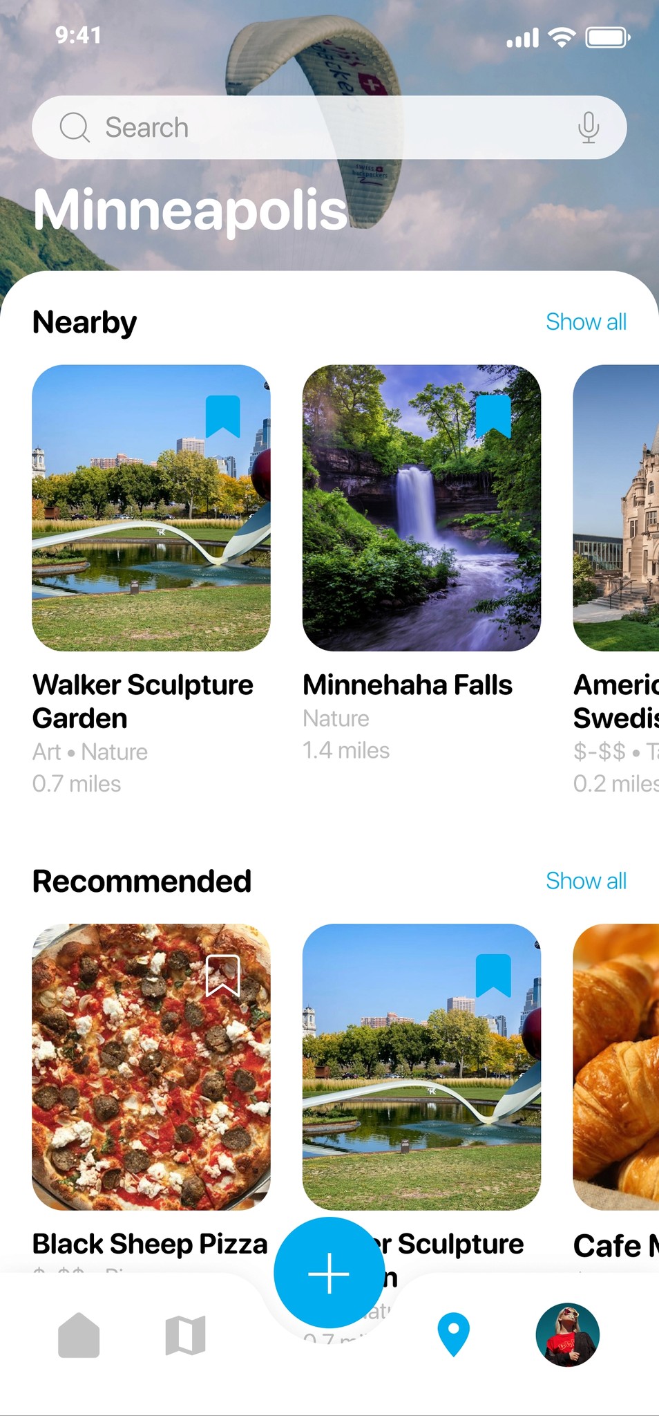
Bunji’s system learns the more you interact and creates personal recommendations.
Create a community based on trust where marketing and followers don't trump over quality content. Root the value of the app in travel before content.
Offer spontaneous destinations for travelers on the go and content for planners who want to do research first.
Lead users to only the most relevant content with user researched content block hierarchy.
Plan
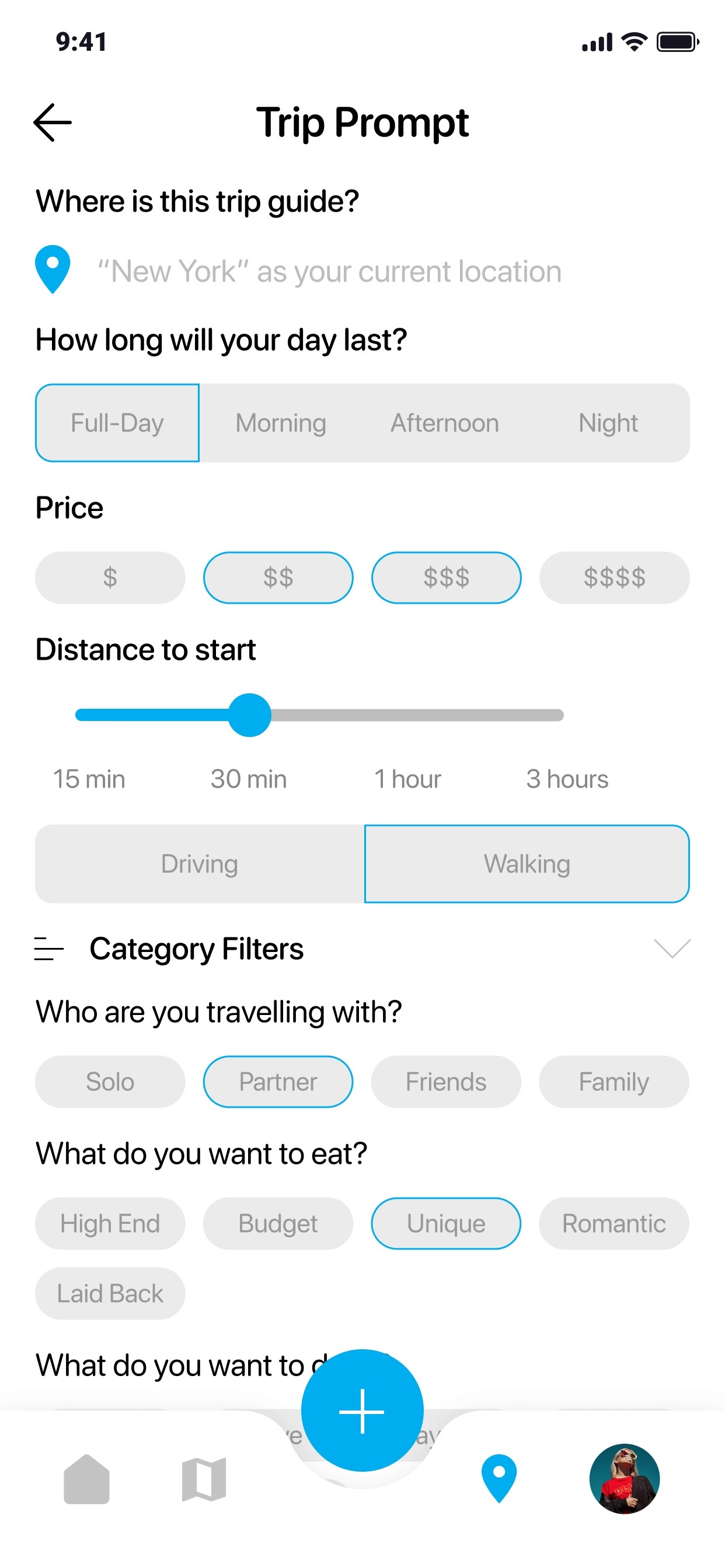
Users create connected itineraries in app and adjust as they go.
Create an intuitive app travelers with any experience level or budget can benefit from.
Customize recommended content to help auto-populate trips fast.
Add your own content for personal dream trips instead.
Share
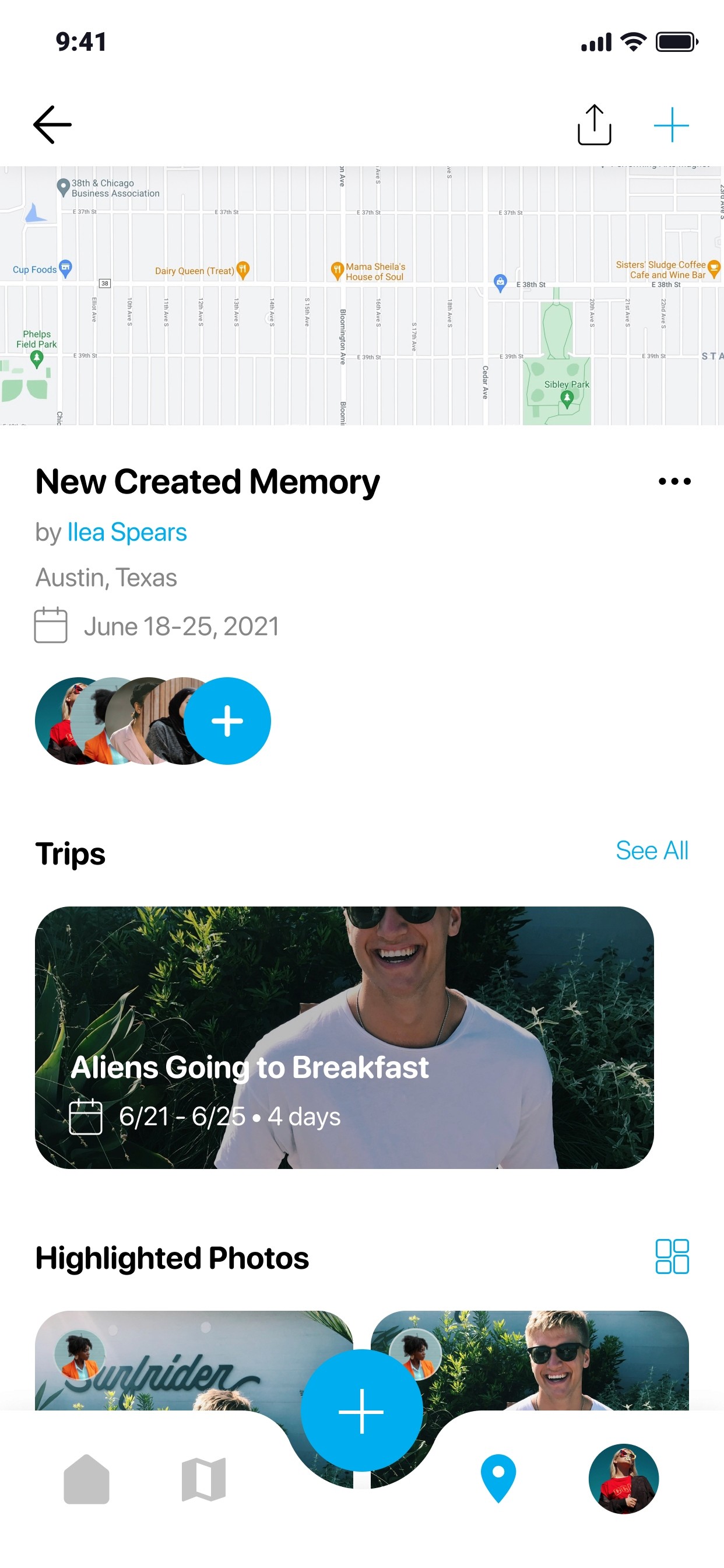
Build visual scrapbooks to remember every step of the journey
Create a vision of traveling, rooting users first in community and content.
Create lasting memories in app by sharing itineraries with friends and adding photos and comments as you travel
Connect
Explore and connect with friends to learn about the world.
Source a community of travelers willing to offer advice and customized plans, creating a revenue flow in and out of Bunji.
Follow travel influencers or locals in places you are traveling to for a more unique and real expereince.
Develop and design Bunji within scope to release in market by the post-Covid travel boom so friends can really connect.
THE PROCESS
Design thinking, research, and unexpected challenges.
Benchmarking
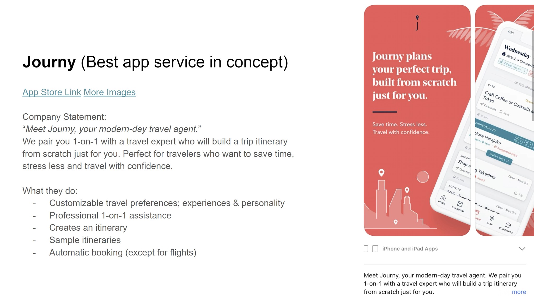
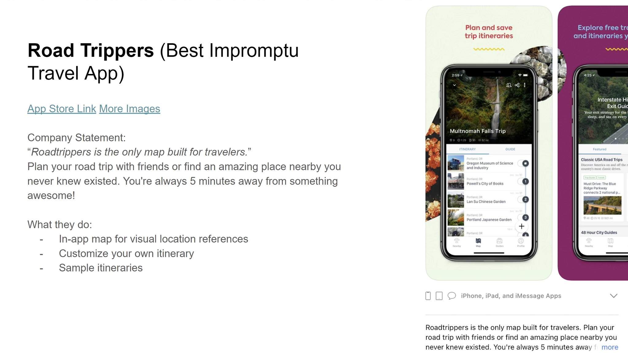
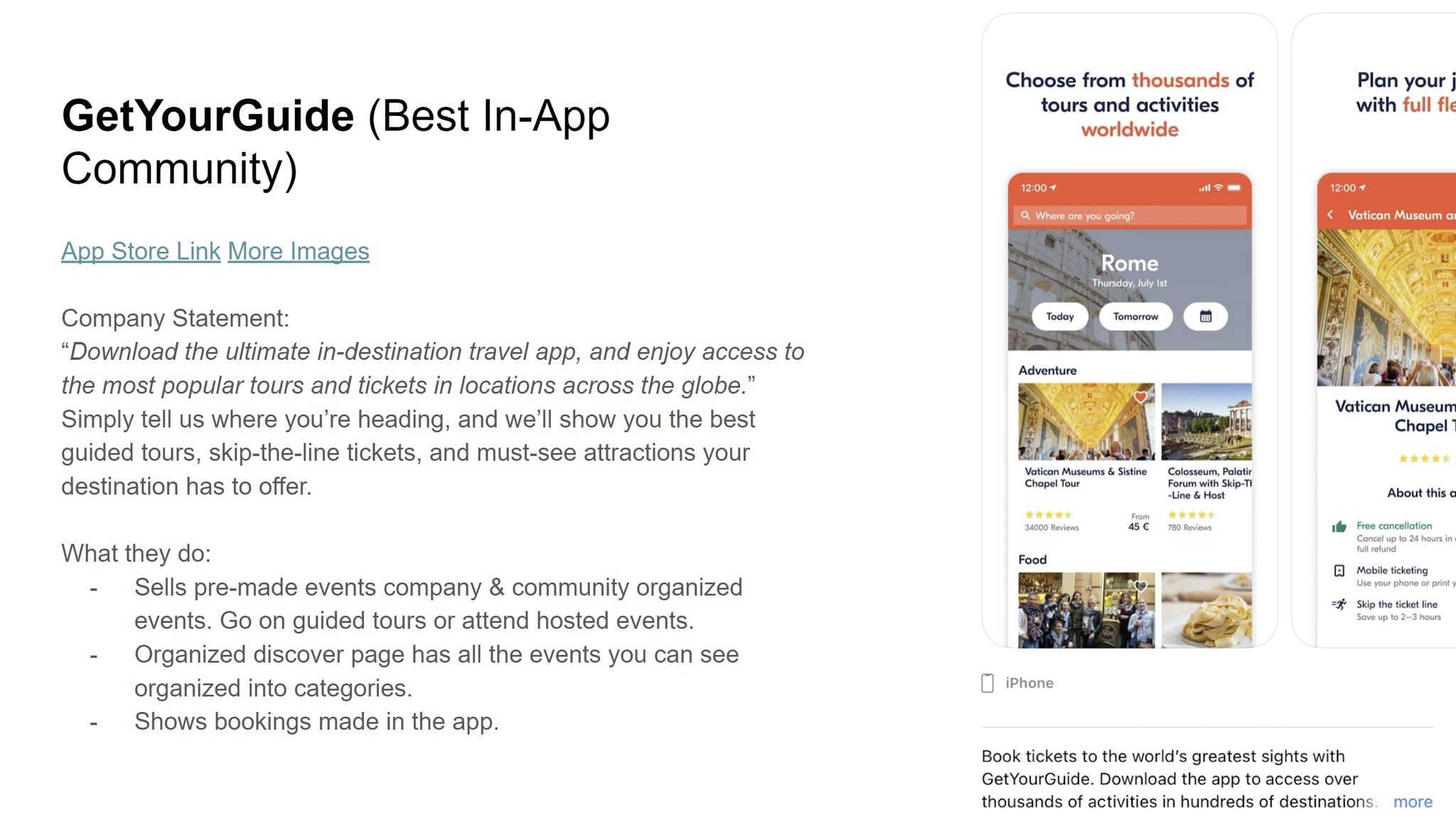
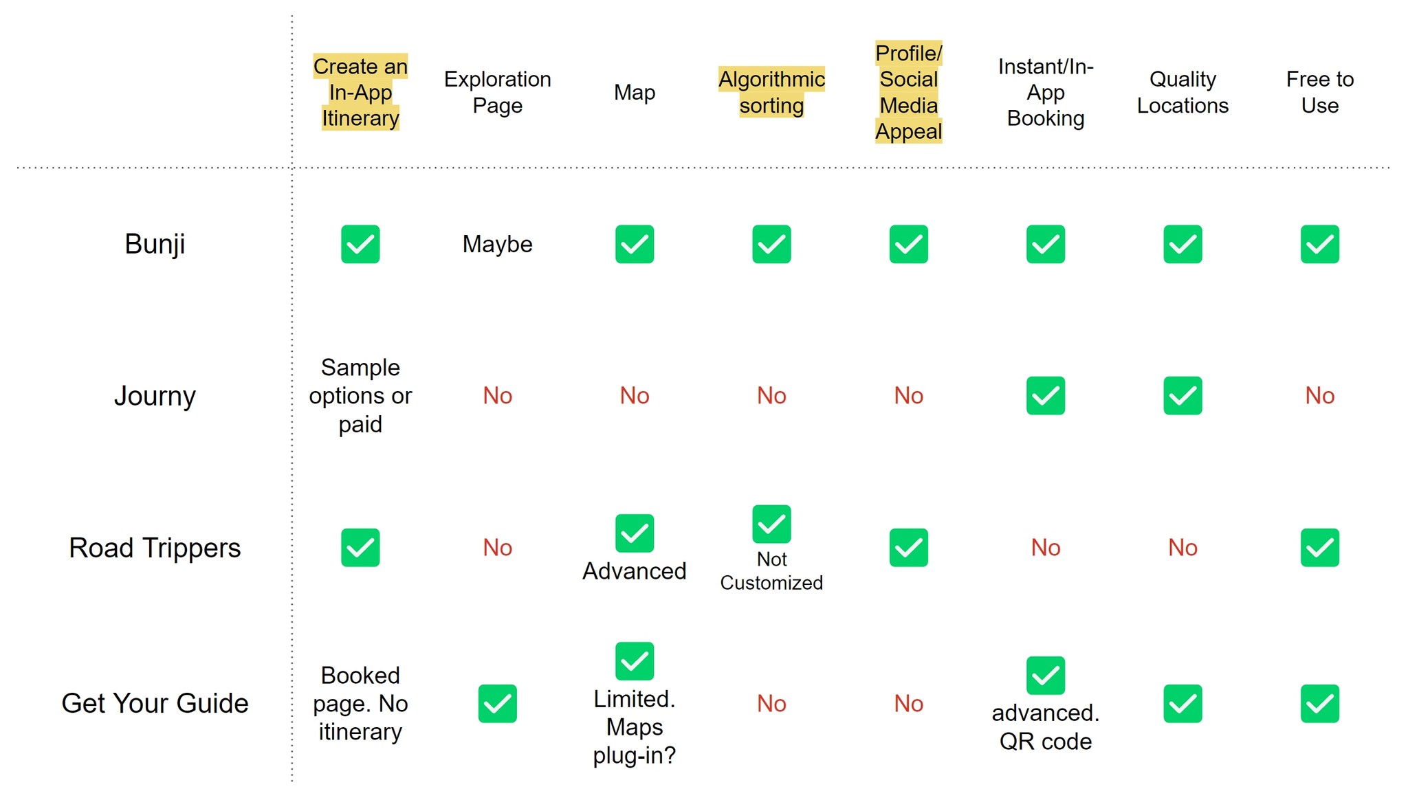
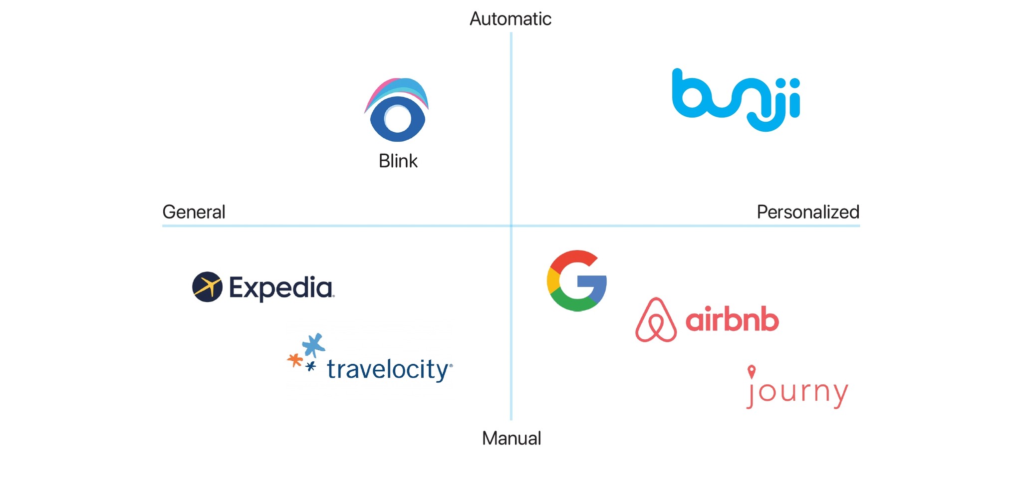
Competitive analysis revealed a market space with white space to grow.
We conducted market research to know, the strengths and weaknesses of our competition, to find market gaps in the target market, to have reliable evidence when making product changes, and to inform the design process before design begun.
Competitive Analysis
Further analysis revealed existing apps were overburdening users with decision paralysis.
In two group sorting sessions, we found existing white market spaces we could develop in by giving more options to automate and expedite the planning process for the user market who is frustrated sorting through low quality locations.
The Future of Travel
We believe travel is competitive and confusing... it shouldn’t be.
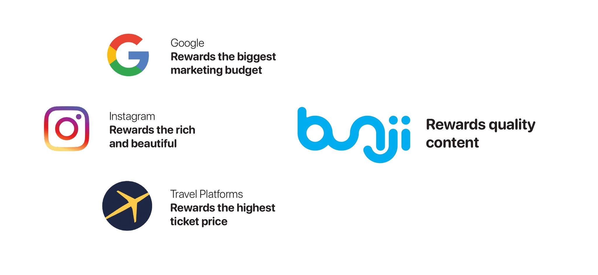
There is no centered location for local-based and insightful travel information. Users have to rely on sites like Google which overburdens with information, Instagram which rewards beauty and popularity, and travel platforms which encourage the highest price point. We know connecting with real travelers and locals who love the places they go will make for higher quality content.
PROTOTYPING
Brainstorming
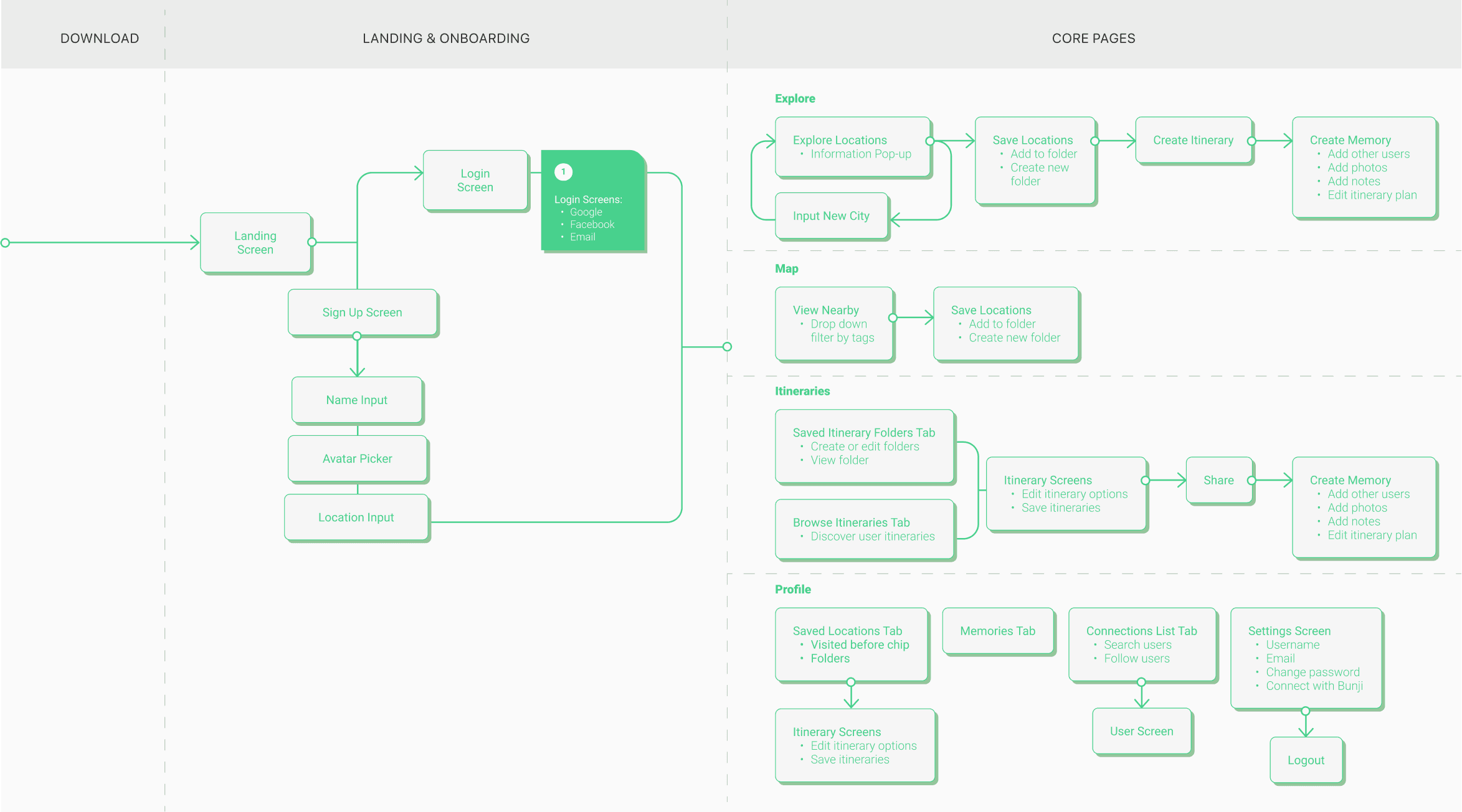
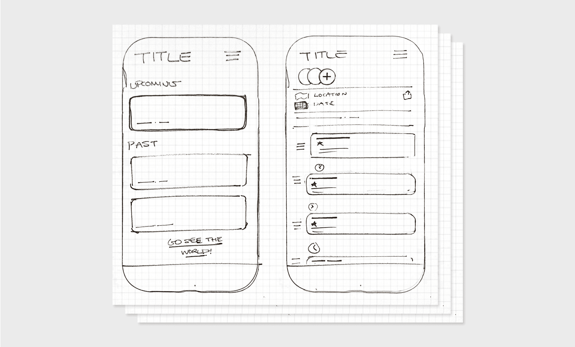
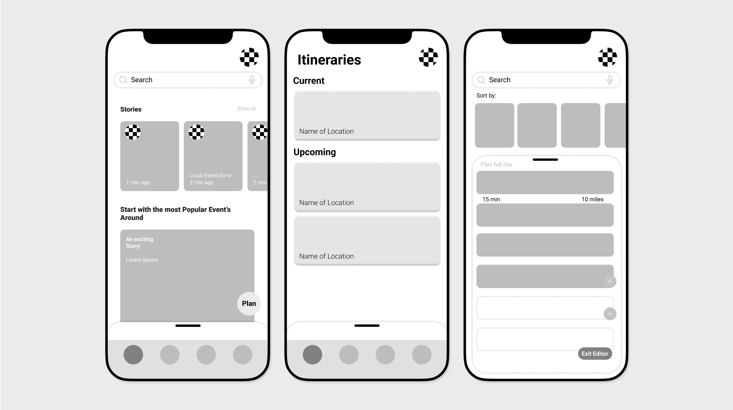
Having an initial source of information from the market and users, my UX/UI partner began designing initial sketches and a moodboard and I started creating wireframes and user flows to get an idea of what inspired us.
THE RESULTS
Milestones
'21
App design wireframed
User testing and user research
Q2. '22
Funding & Investment
Launch (w/ Monetization)
Q3. '22
Interactive prototype done
Front-end dev team chosen
My Role
Bunji is a cross functional team of two UX/UI designers, two back-end developers, and the marketing lead. As a designer it was my role to:
01
Work with back-end developers to visualize interaction design.
02
Format and write UX presentations to directors and investors.
03
Build interactable prototypes to explain design intentions.
04
Assess pain points and opportunities gathered from a network of travel influencers.
05
Create user flows, information architecture, and wireframes.
The final design solves the issues users had with other travel apps on market. By providing a personalized feed of trips there is a focus on getting out instead of browsing pictures that hold no personal meaning. Users are empowered to browse trip plans created by trusted locals and travelers with powerful insights or create their own personalized trip plans in less than a minute.
The whole process is a collaboration between friends, locality, and self which creates beautiful memories you can save forever and reflect on later. I am beyond excited to see this app I’ve put so much time into go on market. Working on a team with deadlines, developers, and input from everyone I could get was a great learning experience.
